Industry Project | 4 months (2020)
Happyness chocolates
Branding | Packaging | Illustration | UX UI design
overview
Happyness is a handmade chocolate company that operates solely on an online mode of selling its product. Their USP is providing chocolates for gifting for every special moment in a person’s life.
My responsibilities:
My role was to create its inception branding, identity design (from scratch), and packaging for this brand, to be launched into the market.
A complete strategy for social media promotion and a website was developed for the brand.
Client: Happyness chocolates
Business type: Startup
Where: Online selling model
Aim: Launch a new product with a new brand
Product: Superior quality handmade chocolates available in 5 flavors
Target group: Millennial and Gen X (24 -65 years)
Problem statement
How can happyness chocolate be introduced to millennials as a go-to gifting solution for any special occasion?

process
A competitor analysis was done to check happyness brand’s direct and indirect challenges. This helped me question & accordingly justify the product pricing and concept model. With an idea of other products in the same price range, I could decide how much value design should add to the brand for the customer to be satisfied with his expense.
The product was priced on the higher end because of its better quality and being an ideal gift. Just like Ferrero Rocher is primarily a chocolate gifting brand.


Brand positioning

add the annotated makrs of what u looked at in each image

Keywords & Imagery
Created a visual board for the words associated with the brand.
Keywords
- Happyness
- Peaceful
- Premium
- Gifting
- Stories/ Moments
Logo and identity
Y smile was incorporated with Futura text to render the brand a mellowed contentment with a formal approach. The name of the brand was big thus the Y also served as a mascot to be used in smaller canvases.
Concept: The client had fixed the name “happyness” for the brand where the ‘Y’ stands for “your happiness” i.e. the happiness of the receiver of the chocolate.

Size Ratio
1:4 (heigth / width)
Scale
Large scale - Fig. 1
Medium scale - Fig. 2
Small scale - Fig. 3
Spacing
The logo and the icon’s exclusion zone is equal to double the gray area in the diagram


Color
A saturated pastel color palette was decided for the brand because the aim was to create a soothing happiness effect with the viewer. The palette was created with multiple colors to maintain its colorful look and homogeneity even with multiple types of illustration styles.
The primary, secondary and tertiary colors were decided by checking grayscale and
emphasis hierarchy.
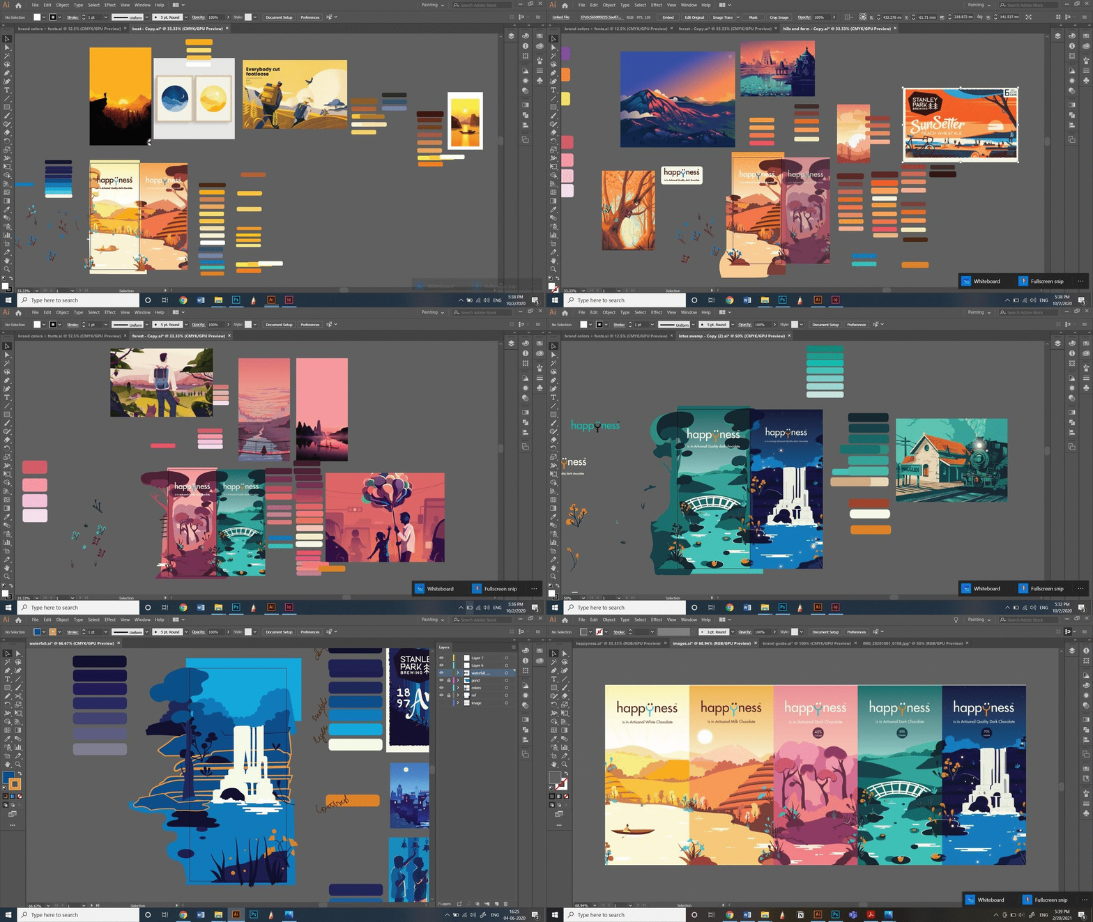
Packaging: concept & illustration
My inspiration was Rangnath Krishnamurthy. I discovered he used monochrome color schemers with one contrasting color for highlight.
The 5 common sale retail packs were designed in a unique way. It was established that nature is something that gives happiness to everyone.


A 3 layer packaging model was decided because of the low melting point of the product and considering the online mode of sale. Thus a strong sleek form was chosen.
Thus a concept was developed to have a big landscape illustration cut across all 5 variants where the time of the day changes as we move to a darker variant of chocolate.
This was done for 2 reasons
1. to make the packaging a collectible
2. to make it easy for new customers to recognize chocolate variants for the common packs and establish recall.


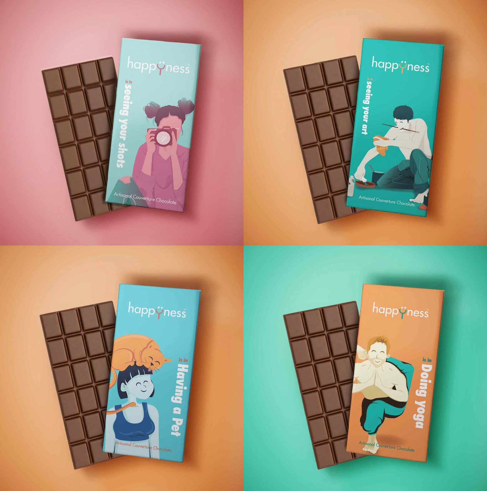
Story packs
Some illustrations from other series e.g. Me and you, festivals, hobbies, etc.
This way with each new illustrator the brand would not suffer. Each time the new illustrator could introduce a new style in his/ her own theme series. This model was inspired from how Archies creates its greeting cards.
Social media
A grid system was created for the social media platforms, to ensure reach and recall for the brand. For the brand to remain active, my partner and I decided to break the posts into categories of – reminders, breathers, and new posts.


Website
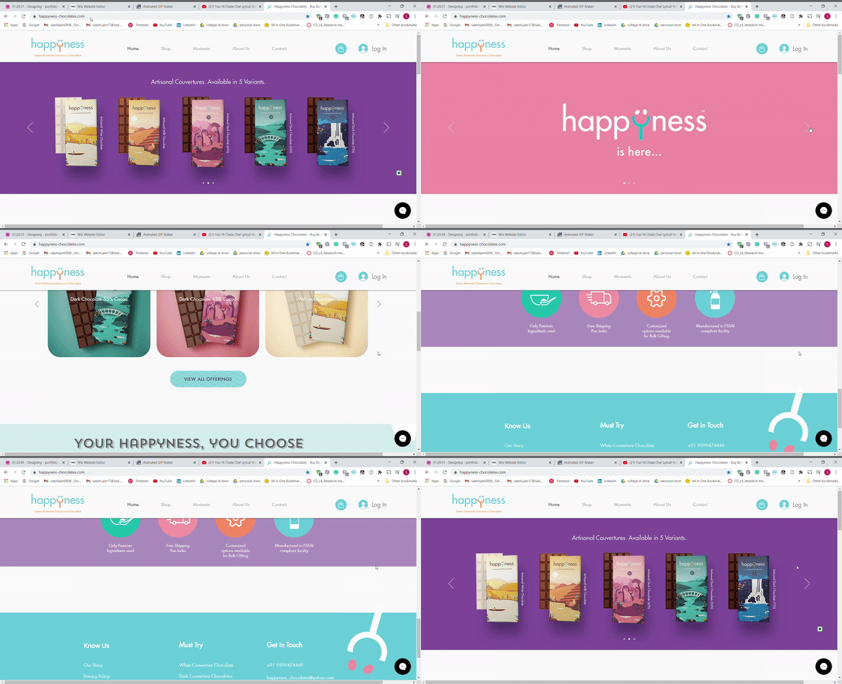
A website was also developed for the brand to enable customers to peruse through its broad product range. It served as a personal e-commerce platform for selling their product in combination with other online platforms like – Amazon, Swiggy, etc. We had no coders and needed a live website. Thus we decided to create one on Wix. I had never made a website before but I was learning some Ux design and had some clue of how to go about it.
Thus I started with my own process of mind-mapping, coggle, wireframing, user personas, user testing, Ui, etc. all the way figuring out Wix.
This was created over a period of 2 months.


